4.5 Visualizations for Numeric Data
4.5.1 Box Plots, Violin Plots, and Histograms
Understanding the distribution of the response
g4 <- train_plot_data %>%
     ggplot(aes(x = "", y = s_40380)) +
     geom_boxplot(fill = "blue", alpha = 0.5) +
     ylab("Clark/Lake Rides (x1000)") +
     theme(
          axis.title.y = element_blank(),
          axis.text.y = element_blank(),
          axis.ticks.y = element_blank()
     ) +
     coord_flip() +
     ylim(-2, 29)

ggplotly(g4)
y_hist <-
ggplot(train_plot_data, aes(s_40380)) +
geom_histogram(binwidth = .7, col = "#D53E4F", fill = "#D53E4F", alpha = .5) +
xlab("Clark/Lake Rides (x1000)") +
ylab("Frequency") +
ggtitle("(a)") +
xlim(-2,29) +
theme(
axis.title.x = element_blank(),
axis.text.x = element_blank(),
axis.ticks.x = element_blank(),
axis.title.y = element_blank(),
axis.text.y = element_blank(),
axis.ticks.y = element_blank()
)
y_box <-
ggplot(train_plot_data, aes(x = "", y = s_40380)) +
geom_boxplot(alpha = 0.2) +
ylab("Clark/Lake Rides (x1000)") +
ggtitle("(b)") +
theme(
axis.title.x = element_blank(),
axis.text.x = element_blank(),
axis.ticks.x = element_blank(),
axis.title.y = element_blank(),
axis.text.y = element_blank(),
axis.ticks.y = element_blank()
) +
coord_flip() +
ylim(-2,29)
y_violin <-
ggplot(train_plot_data, aes(x = "", y = s_40380)) +
geom_violin(alpha = 0.2) +
ylab("Clark/Lake Rides (x1000)") +
ggtitle("(c)") +
theme(
axis.title.y = element_blank(),
axis.text.y = element_blank(),
axis.ticks.y = element_blank()
) +
coord_flip() +
ylim(-2,29)
y_hist / y_box / y_violin## Warning: Removed 2 rows containing missing values (`geom_bar()`).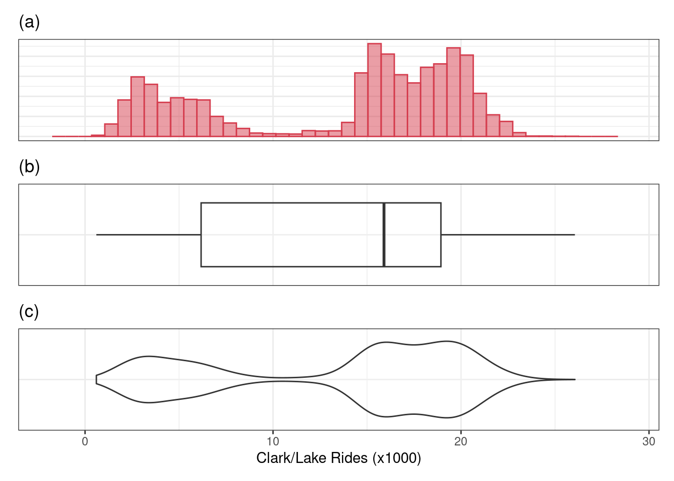
The histogram (a) allows us to see that there are two peaks or modes in ridership distribution indicating that there may be two mechanisms affecting ridership.
The box plot (b) does not have the ability to see multiple peaks in the data.
However the violin plot (c) provides a compact visualization that identifies the distributional nuance.
4.5.2 Augmenting Visualizations through Faceting, Colors, and Shapes
Distribution of daily ridership at the Clark/Lake stop from 2001 to 2016 colored and faceted by weekday and weekend.
l10_breaks <- scales::trans_breaks("log10", function(x) 10^x)
l10_labels <- scales::trans_format("log10", scales::math_format(10^.x))

all_pred %>%
  mutate(pow = as.factor(ifelse(dow %in% c("Sat","Sun"), "Weekend", "Weekday"))) %>%
  ggplot(aes(s_40380 * 1000, fill = pow, col = pow)) +
  facet_wrap( ~ pow, nrow = 2, scales = "free_y") +
  geom_histogram(binwidth = .03, alpha = .5) +
  scale_fill_manual(values = c("#D53E4F", "#3ed5c4")) +
  scale_color_manual(values = c("#D53E4F", "#3ed5c4")) +
  scale_x_log10(breaks = l10_breaks, labels = l10_labels) +
  xlab("Clark/Lakes Rides") +
  ylab("Frequency") +
  theme(legend.position="none")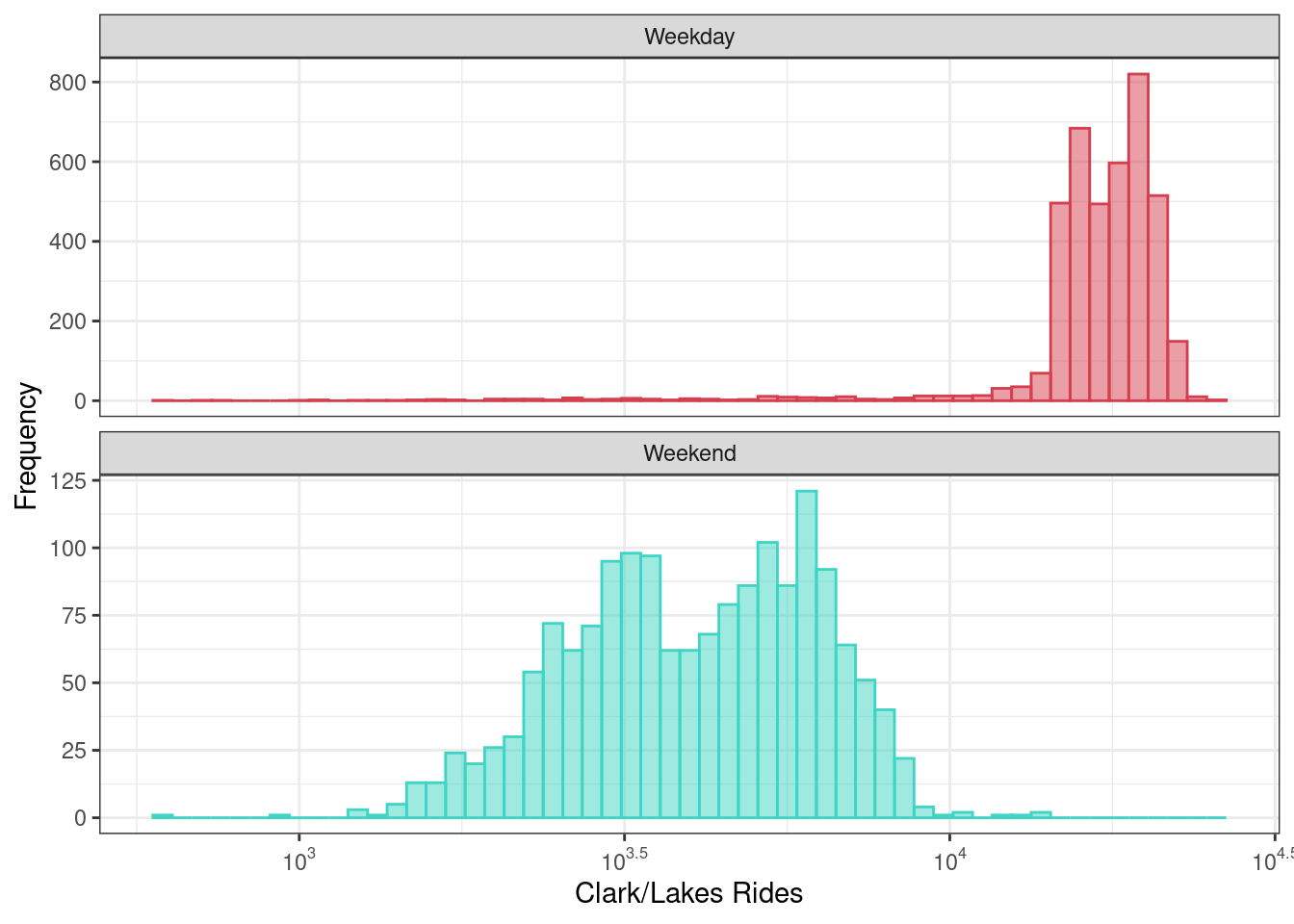
4.5.3 Scatterplots
Scatterplots are numeric-to-numeric visualizations.
Example: A scatter plot of the 14-day lag ridership at the Clark/Lake station and the current-day ridership at the same station.
# create 'pow' (weekend/weekday flag)
train_plot_data <-
  train_plot_data %>%
  mutate(
    pow = ifelse(dow %in% c("Sat", "Sun"), "Weekend", "Weekday"),
    pow = factor(pow)
  )
train_plot_data %>%
select(l14_40380, s_40380, pow) %>%
ggplot(aes(l14_40380,s_40380, col = pow)) +
geom_point(alpha=0.5) +
scale_color_manual(values = c("#D53E4F", "#3ed5c4")) +
xlab("Two-week Lag in Ridership (x1000)") +
ylab("Current Day Ridership (x1000)") +
theme(legend.title=element_blank()) +
coord_equal()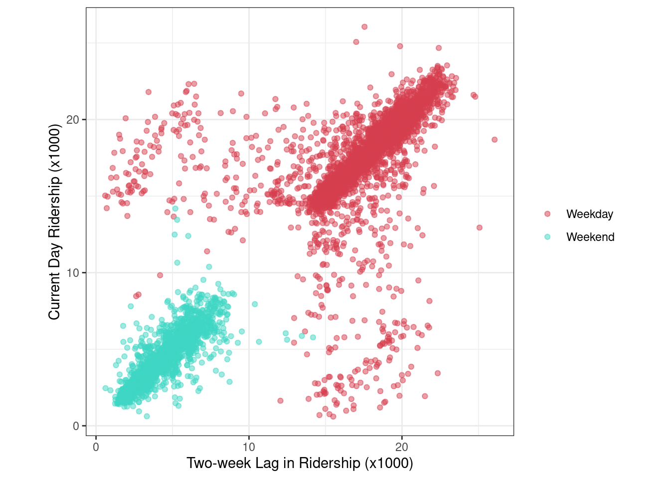
In general, there is a strong linear relationship between the 14-day lag and current-day ridership.
However, there are many 14-day lag/current day pairs of days that lie far off from the overall scatter of points.
4.5.4 Scatterplots - Exclude U.S. holidays
Let’s filter major U.S. holidays from the train_plot_data.
commonHolidays <-
  c("USNewYearsDay", "Jan02_Mon_Fri", "USMLKingsBirthday",
    "USPresidentsDay", "USMemorialDay", "USIndependenceDay",
    "Jul03_Mon_Fri", "Jul05_Mon_Fri", "USLaborDay", "USThanksgivingDay",
    "Day_after_Thx", "ChristmasEve", "USChristmasDay", "Dec26_wkday",
    "Dec31_Mon_Fri")

any_holiday <-
  train_plot_data %>%
  dplyr::select(date, !!commonHolidays) %>%
  gather(holiday, value, -date) %>%
  group_by(date) %>%
  summarize(common_holiday = max(value)) %>%
  ungroup() %>%
  mutate(common_holiday = ifelse(common_holiday == 1, "Holiday", "Non-holiday")) %>%
  inner_join(train_plot_data, by = "date")

holiday_values <-
  any_holiday %>%
  dplyr::select(date, common_holiday)

make_lag <- function(x, lag = 14) {
  x$date <- x$date + days(lag)
  prefix <- ifelse(lag < 10, paste0("0", lag), lag)
  prefix <- paste0("l", prefix, "_holiday")
  names(x) <- gsub("common_holiday", prefix, names(x))
  x
}

lag_hol <- make_lag(holiday_values, lag = 14)
holiday_data <-
any_holiday %>%
left_join(lag_hol, by = "date") %>%
mutate(
year = factor(year),
l14_holiday = ifelse(is.na(l14_holiday), "Non-holiday", l14_holiday)
)
no_holiday_plot <-
holiday_data %>%
dplyr::filter(common_holiday == "Non-holiday" & l14_holiday == "Non-holiday") %>%
ggplot(aes(l14_40380, s_40380, col = pow)) +
geom_point(alpha=0.5) +
scale_color_manual(values = c("#D53E4F", "#3ed5c4")) +
xlab("14-Day Lag") +
ylab("Current Day") +
theme(legend.title=element_blank())+
coord_equal()
no_holiday_plot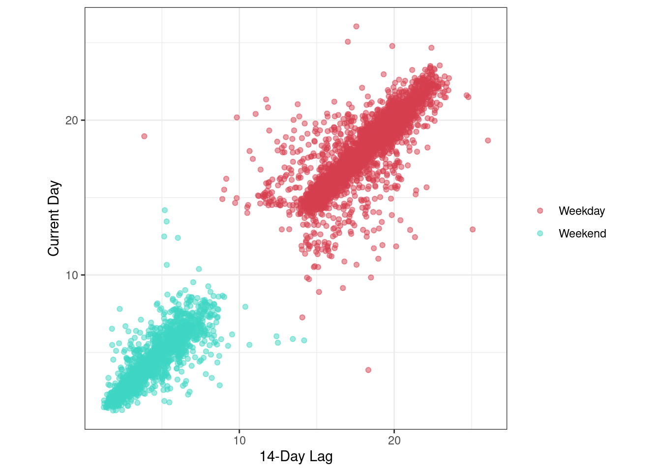
- Filtering the holidays, the weekday scatterplot compactness improves (less outliers scattered on both sides of the cluster).
4.5.5 Heatmaps
For the ridership data, we will create a month and day predictor, a year predictor, and an indicator of weekday ridership less than 10,000 rides.
heatmap_data <-
  all_pred  %>%
  mutate(pow = as.factor(ifelse(dow %in% c("Sat","Sun"), "Weekend", "Weekday"))) %>%
  dplyr::select(date, s_40380, pow) %>%
  mutate(
    mmdd = format(as.Date(date), "%m-%d"),
    yyyy = format(as.Date(date), "%Y"),
    lt10 = ifelse(s_40380 < 10 & pow=="Weekday", 1, 0)
  )

# U.S. holidays
break_vals <-
  c("01-01","01-15","02-01","02-15","03-01","03-15","04-01",
    "04-15","05-01","05-15","06-01","06-15", "07-01","07-15",
    "08-01", "08-15","09-01","09-15","10-01","10-15","11-01",
    "11-15","12-01","12-15")
heatmap_data %>%
ggplot(aes(yyyy, mmdd)) +
geom_tile(aes(fill = lt10), colour = "white") +
scale_fill_gradient(low = "transparent", high = "red") +
scale_y_discrete(
breaks = break_vals
) +
xlab("Year") +
ylab("Month & Day") +
theme_bw() +
theme(legend.position = "none")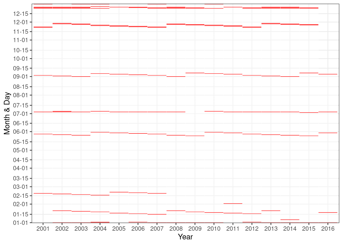
This visualization indicates that the distinct patterns of low ridership on weekdays occur on and around major US holidays.
4.5.6 Correlation Matrix Plots
Visualization of the correlation matrix of the 14-day lag ridership station predictors for non-holiday, weekdays in 2016.
cor_mat <-
  holiday_data %>%
  dplyr::filter(year == "2016") %>%
  dplyr::select(matches("l14_[0-9]"), pow, common_holiday) %>%
  dplyr::filter(pow == "Weekday" & common_holiday == "Non-holiday") %>%
  dplyr::select(-pow, -common_holiday) %>%
  cor()
cor_map <-
heatmaply_cor(
cor_mat,
symm = TRUE,
cexRow = .0001,
cexCol = .0001,
branches_lwd = .1
)
cor_mapRidership across stations is positively correlated (red) for nearly all pairs of stations.
This means that low ridership at one station corresponds to relatively low ridership at another station, and high ridership at one station corresponds to relatively high ridership at another station.
For feature selection, the high degree of correlation is a clear indicator that the information present across the stations is redundant and could be eliminated or reduced.
4.5.7 Line plots
Monthly average ridership per year by weekday (excluding holidays) or weekend.
year_cols <- colorRampPalette(colors = brewer.pal(n = 9, "YlOrRd")[-1])(16)

holiday_data %>%
  dplyr::filter(common_holiday == "Non-holiday") %>%
  dplyr::mutate(year = factor(year)) %>%
  group_by(
    month = lubridate::month(date, label = TRUE, abbr = TRUE),
    year,
    pow
  ) %>%
  dplyr::summarize(average_ridership = mean(s_40380, na.rm = TRUE)) %>%
  ggplot(aes(month, average_ridership)) +
  facet_wrap( ~ pow, ncol = 2) +
  geom_line(aes(group = year, col = year), size = 1.1) +
  xlab("") +
  ylab("Geometric Mean Ridership (x1000)") +
  scale_color_manual(values = year_cols) +
  guides(
    col = guide_legend(
      title = "",
      nrow = 2,
      byrow = TRUE
    )
  ) +
  theme(legend.position = "top")
## `summarise()` has grouped output by 'month', 'year'. You can override using the
## `.groups` argument.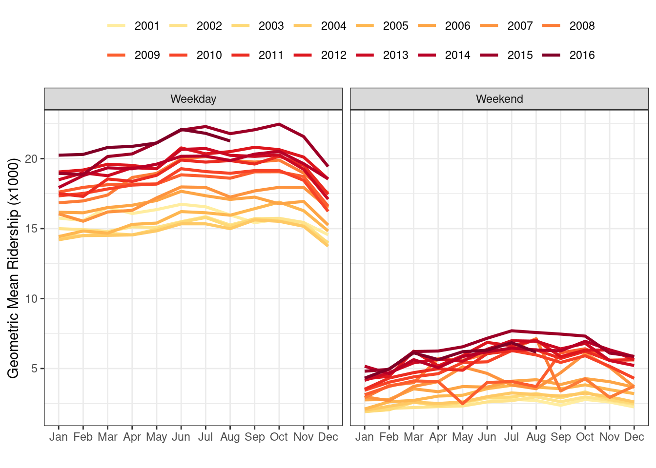
Weekend ridership also shows annual trends but exhibits more variation within the trends for some years.
The Weekend line plots have the highest variation during 2008, with much higher ridership in the summer.
Monthly average gas price per gallon (USD) per year.
holiday_data %>%
  dplyr::filter(common_holiday == "Non-holiday") %>%
  mutate(year = factor(year)) %>%
  group_by(
    month = lubridate::month(date, label = TRUE, abbr = TRUE),
    year
  ) %>%
  dplyr::summarize(average_l14_gas_price = mean(l14_gas_price, na.rm = TRUE)) %>%
  ggplot(aes(x = month, y = average_l14_gas_price)) +
  geom_line(aes(group = year, col = year), size = 1.3) +
  xlab("") +
  ylab("Average Gas Price/Gallon ($)") +
  scale_color_manual(values = year_cols) +
  guides(
    col = guide_legend(
      title = "",
      nrow = 2,
      byrow = TRUE
    )
  ) +
  theme(legend.position = "top")
## `summarise()` has grouped output by 'month'. You can override using the
## `.groups` argument.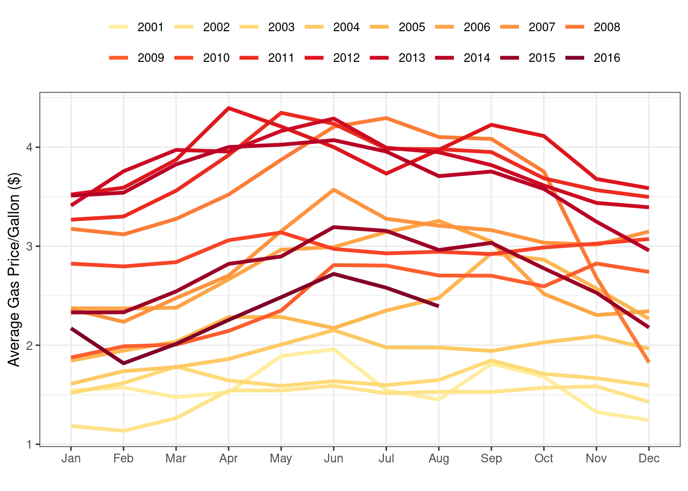
- Prices spike in the summer of 2008, which is at the same time that weekend ridership spikes.
4.5.8 Principal Component Analysis (PCA)
Principal component analysis of the 14-day station lag ridership.
lag_14_data <-
  holiday_data %>%
  dplyr::select(matches("l14_[0-9]"))

PCA_station <- prcomp(lag_14_data)

var_explained <- c(0, PCA_station$sdev ^ 2)
cumulative_var <- cumsum(var_explained)
pct_var_explained <- 100 * cumulative_var / max(cumulative_var)

var_df <- tibble(
  Component = seq_along(pct_var_explained) - 1,
  pct_var_explained = pct_var_explained
)
score_data <-
  tibble(
    y = holiday_data$s_40380,
    year = factor(holiday_data$year),
    pow = holiday_data$pow,
    PC1 = PCA_station$x[, 1],
    PC2 = PCA_station$x[, 2],
    dow = holiday_data$dow
  )
pca_rng <- extendrange(c(score_data$PC1, score_data$PC2))
var_plot <-
var_df %>%
dplyr::filter(Component <= 50) %>%
ggplot(aes(x = Component, y = pct_var_explained)) +
geom_line(size = 1.3) +
ylim(0, 100) +
xlab("Component") +
ylab("Percent Variance Explained") +
ggtitle("(a)")
score_plot12 <-
ggplot(score_data, aes(PC1,PC2)) +
geom_point(size = 1, alpha = 0.25) +
xlab("Component 1") +
ylab("Component 2") +
xlim(pca_rng) + ylim(pca_rng) +
ggtitle("(b)")
score1_vs_day <-
ggplot(score_data, aes(x = dow, y = PC1)) +
geom_violin(adjust = 1.5) +
ylab("Component 1") +
xlab("") +
ylim(pca_rng) +
ggtitle("(c)")
score2_vs_year <-
ggplot(score_data, aes(x = year, y = PC2, col = year)) +
geom_violin(adjust = 1.5) +
ylab("Component 2") +
xlab("") +
# ylim(pca_rng) +
scale_color_manual(values = year_cols)+
theme(legend.position = "none") +
ggtitle("(d)")
(var_plot + score_plot12) / score1_vs_day / score2_vs_year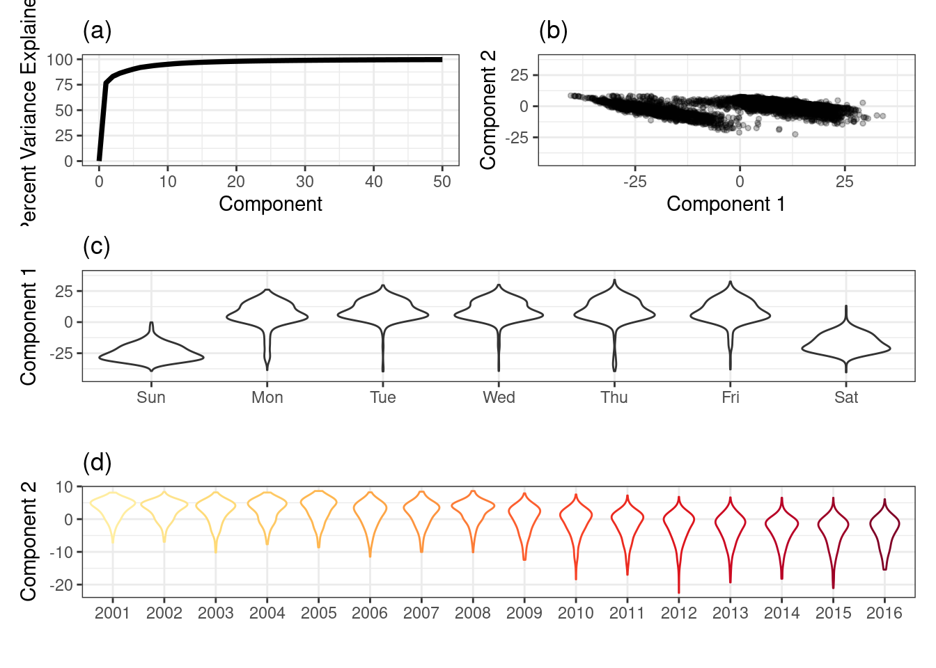
The cumulative variability summarized across the first 10 components (a).
A scatter plot of the first two principal components. The first component focuses on variation due to part of the week while the second component focuses on variation due to time (year) (b).
The relationship between the first principal component and ridership for each day of the week at the Clark/Lake station (c).
The relationship between second principal component and ridership for each year at the Clark/Lake station (d).