6.3 New Features from Multiple predictors
The previous two sections focused on adjusting our features and creating new features from a single predictor, but we can also create new features from all of our predictors at once. This can correct issues like multicollinearity and outliers, while also reducing the dimensionality and speeding up computation times.
There are a ton of different techniques for this that are essentially broken down into four main parts: linear projections, autoencoders, Spatial sign, and Distance and Depth features.
6.3.1 Linear Projection Methods
More predictors is not always better! Especially if you have redundant information. This section is all about identifying meaningful projections of the original data. The unsupervised methods, like PCA, tend not to increase model performance, yet they do save computational time. Supervised approaches, like partial least squares, DO however if you have enough data to prevent overfitting.
6.3.1.1 Principal Component Analysis (PCA)
PCA finds a linear combination of the original predictors that summarizes the maximum amount of variation. Since they are orthogonal, the predictor space is partitioned in a way that does not overlap. (uncorrelated)

Principal component analysis of two highly correlated predictors
We can see from the graph below that the first component USUALLY contains the most information. We can also see that some methods do much better than others.
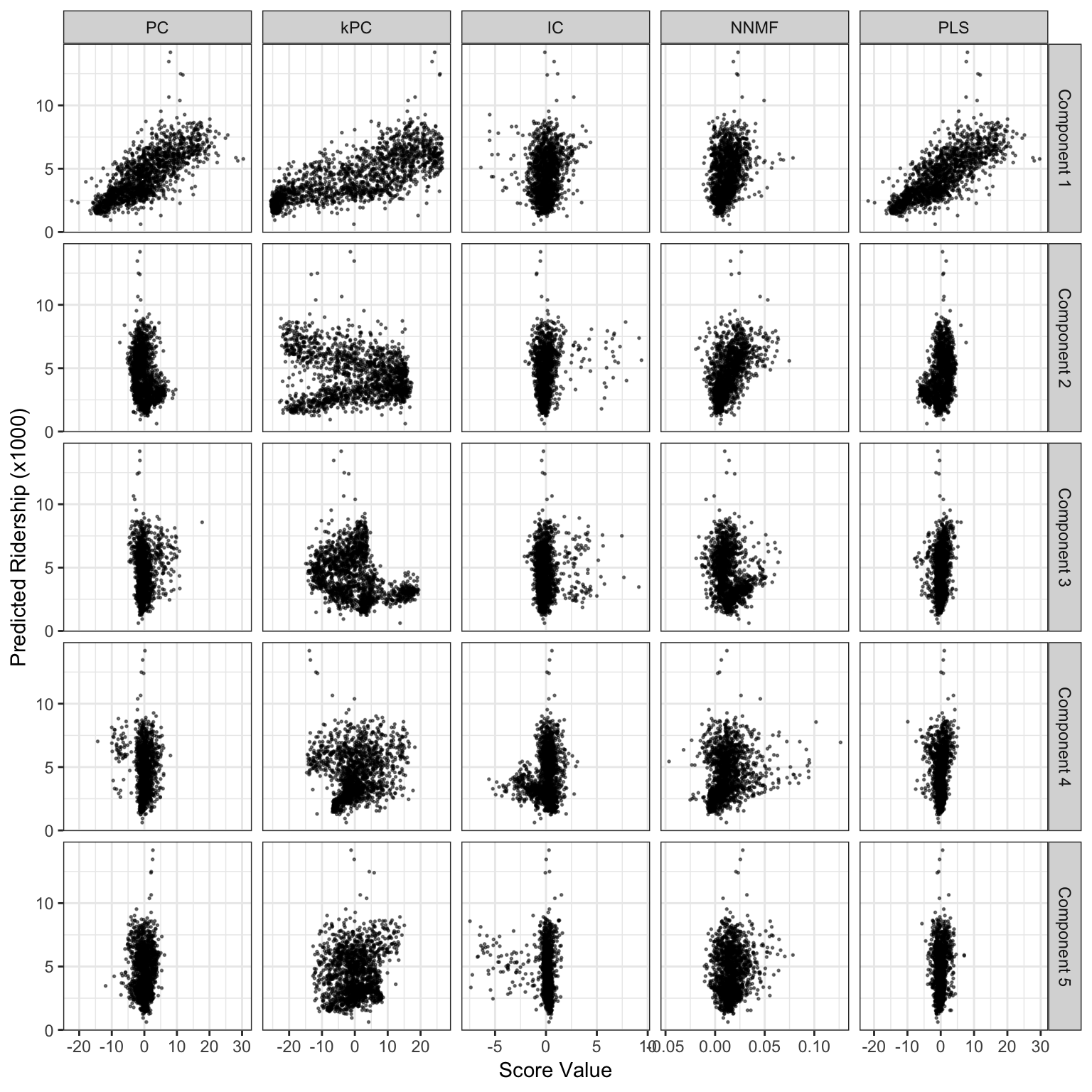
Score values from several linear projection methods for the weekend ridership at Clark and Lake. The x-axis values are the scores for each method and the y-axis is ridership (in thousands).
Visualizing the principal components with a heat map can help us identify which predictors are impacting each component. The figure below visualizes the Chicago train dataset. We can see after the first component that lines are clustered together meaning the line probably has an effect on our outcome.
## oper 1 step center [training]
## oper 2 step scale [training]
## oper 3 step pca [training]
## The retained training set is ~ 0.26 Mb  in memory.
## PC01 PC02 PC06 PC07 PC20 PC11
## 0.788363004 -0.340091805 0.160229143 0.140769244 0.128354958 0.107559442
## PC19 PC04 PC16 PC03 PC18 PC10
## -0.099391044 0.093115558 -0.087066549 0.053463985 0.050741445 -0.049221526
## PC09 PC14 PC15 PC12 PC08 PC17
## 0.037859109 0.034199452 -0.024362732 0.018376755 0.016049202 0.014475841
## PC13 PC05
## 0.007675887 0.0015794826.3.1.2 Kernel PCA
PCA is really effective when the predictors are linearly correlated, but what if the relationship is not actually linear but quadratic? That’s were kernel PCA comes in. There are MANY different kernels based on the shape of the predictor space (Polynomial, Gaussian etc), so you really need to inspect your data before setting kPCA up.
Because kPCA is more flexible, it can often lead to much better results. The firgure below shows how using basic PCA would actually lead to a poor fit.

A comparison of PCA and kernel PCA. (a) The training set data. (b) The simulated relation between x 1 and the outcome. (c) The PCA results (d) kPCA using a polynomial kernel shows better results. (e) Residual distributions for the two dimension reduction methods.
6.3.1.3 Independent Component Analysis
PCA components are uncorrelated with each other, but they are often not independent.That’s where ICA comes in! ICA is similar to PCA except that it components are also as statistically independent as possible. Unlike PCA, there is no ordering in ICA.
Preprocessing is essential for ICA. Predictors must be centered and then “whitened”, which means that PCA is calculated BEFORE ICA, which seems rather odd.
6.3.1.4 Non-negative factorization
- when features are greater than or equal to zero. Most popular for text data! where the predictors are word counts, imaging, and biological measures.
6.3.1.5 Partial Least Squares
PLS is supervised version of pca that guides dimension reduction optimally related to the response. Finds latent variables that have optimal covariance with the response. Because of this supervized approach, you generally need fewer components than PCA, BUT you risk overfitting.

Model results for the Chicago weekend data using different dimension reduction methods (each with 20 components).
6.3.1.6 Autoencoders
Computationally complex multivariate method for finding representations of the predictor space, primarily used in deep learning. Generally they don’t have any actual interpretation but they have some strengths. Autoencoders are really good when there is a large amount of unlabled data.
Example: used in the pharmaceutical industry to estimate how good a drug might be based on its chemical structure. To simulate a drug discovery project just starting up, a random set of 50 data points were used as a training set and another random set of 25 were allocated to a test set. The remaining 4327 data points were treated as unlabeled data that do not have melting point data.

The results of fitting and autoencoder to a drug discovery data set. Panel (a) is the holdout data used to measure the MSE of the fitting process and (b) the resampling profiles of K-nearest neighbors with (black) and without (grey) the application of the autoencoder.
6.3.1.7 Spatial Sign
Spatial Sign is primarily used in image analysis, transforms the predictors based on their center to the distribution and projects them onto an nD sphere.

Scatterplots of a classification data set before (a) and after (b) the spatial sign transformation.
THE EXAMPLE THEY GIVE INVOLVES CLASSIFYING IMAGES OF ANIMAL POOP!
Spatial sign is really good at decreasing impact of outliers.
6.3.1.8 Distance and depth features
Distance and Depth Features take a semi-supervised approach for classification problems. Predictors are recomputed based on the distance to class centroid, sort of like knearest neighbor.

Examples of class distance to centroids (a) and depth calculations (b). The asterisk denotes a new sample being predicted and the squares correspond to class centroids.