10.2 Modeling of lung cancer risk in Pennsylvania
Bayesian spatial model to estimate the risk of lung cancer and assess its relationship with smoking in Pennsylvania, USA, in 2002.
## [1] "geo" "data" "smoking" "spatial.polygon"## county cases population race gender age
## 1 adams 0 1492 o f Under.40
## 2 adams 0 365 o f 40.59
## 3 adams 1 68 o f 60.69
## 4 adams 0 73 o f 70+
## 5 adams 0 23351 w f Under.40
## 6 adams 5 12136 w f 40.59library(sf)
map <- st_as_sf(pennLC$spatial.polygon)
countynames <- sapply(slot(pennLC$spatial.polygon, "polygons"),
function(x){slot(x, "ID")})
map$county <- countynames
head(map)## Simple feature collection with 6 features and 1 field
## Geometry type: POLYGON
## Dimension: XY
## Bounding box: xmin: -80.51776 ymin: 39.72889 xmax: -75.53303 ymax: 41.1441
## Geodetic CRS: +proj=longlat
## geometry county
## 1 POLYGON ((-77.4467 39.96954... adams
## 2 POLYGON ((-80.14534 40.6742... allegheny
## 3 POLYGON ((-79.21142 40.9091... armstrong
## 4 POLYGON ((-80.1568 40.85189... beaver
## 5 POLYGON ((-78.38063 39.7288... bedford
## 6 POLYGON ((-75.53303 40.4508... berks## # A tibble: 6 × 2
## county Y
## <fct> <int>
## 1 adams 55
## 2 allegheny 1275
## 3 armstrong 49
## 4 beaver 172
## 5 bedford 37
## 6 berks 308p1 <- map %>%
right_join(d, by = c("county" = "county")) %>%
ggplot()+
geom_sf(aes(fill=Y), color="navy")+
scale_fill_continuous(low="white", high="navy")+
geom_sf_text(aes(label=county,alpha=Y,color="orange"), size=2)+
coord_sf()+
labs(title = "Lung cancer cases",
subtitle = "Pennsylvania 1990-1994",
caption = "Source: PennLC data",
fill = "Cases")+
theme_minimal()
p1## Warning in st_point_on_surface.sfc(sf::st_zm(x)): st_point_on_surface may not
## give correct results for longitude/latitude data
10.2.1 Expected cases
\[ E_i = \sum_{j=1}^m r_j^{(s)} n_j^{(s)} \]
where \(r_j^{(s)}\) is the rate of disease in stratum \(j\) and \(n_j^{(s)}\) is the population in stratum \(j\).
pennLC$data <- pennLC$data[order(pennLC$data$county,
                                 pennLC$data$race,
                                 pennLC$data$gender,
                                 pennLC$data$age), ]

E <- expected(population = pennLC$data$population,
              cases = pennLC$data$cases,
 # 2 races, 2 genders, and 4 age groups (2×2×4 = 16)
              n.strata = 16)
d$E <- E
head(d)
## # A tibble: 6 × 3
## county Y E
## <fct> <int> <dbl>
## 1 adams 55 69.6
## 2 allegheny 1275 1182.
## 3 armstrong 49 67.6
## 4 beaver 172 173.
## 5 bedford 37 44.2
## 6 berks 308 301.Let’s visualize the difference between observed and expected cases.
map %>%
  right_join(d, by = c("county" = "county")) %>%
  pivot_longer(cols = c("Y", "E"),
               names_to = "type",
               values_to = "value") %>%
  mutate(value=round(value))%>%
  ggplot()+
  geom_sf(aes(fill=value), color="navy")+
  scale_fill_continuous(low="white", high="navy")+
  geom_sf_text(aes(label=value,
                   alpha=value,
                   color="orange"),
               fontface="bold",
               size=2)+
  coord_sf()+
  facet_wrap(~type)+
  guides(fill = guide_colorbar(title = "Cases"),alpha="none",color="none")+
  labs(title = "Lung cancer Observed and Expected cases",
       subtitle = "Pennsylvania 1990-1994",
       caption = "Source: PennLC data",
       fill = "Type")+
  theme_minimal()+
  theme(axis.text = element_blank(),
        axis.title = element_blank(),
        legend.position = "bottom")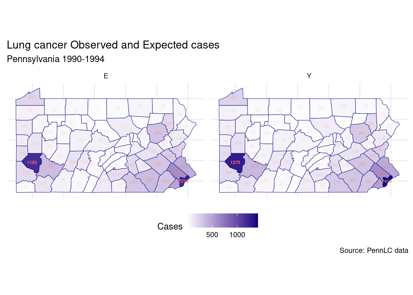
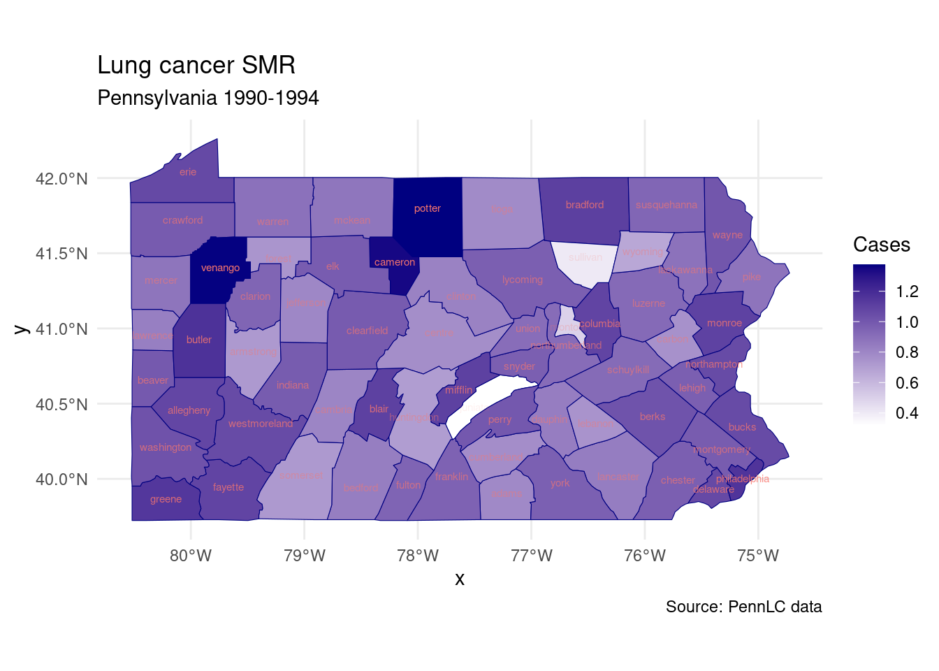
10.2.2 Standardized Mortality Ratios
\[ SMR_i = \frac{Y_i}{E_i} \]
if \(SMR_i > 1\), then the county has more cases than expected, and if \(SMR_i < 1\), then the county has fewer cases than expected.
# add the smoking data
d <- dplyr::left_join(d, pennLC$smoking, by = "county")
d$SMR <- d$Y/d$E
head(d)
## # A tibble: 6 × 5
## county Y E smoking SMR
## <fct> <int> <dbl> <dbl> <dbl>
## 1 adams 55 69.6 0.234 0.790
## 2 allegheny 1275 1182. 0.245 1.08
## 3 armstrong 49 67.6 0.25 0.725
## 4 beaver 172 173. 0.276 0.997
## 5 bedford 37 44.2 0.228 0.837
## 6 berks 308 301. 0.249 1.02ggplot(d, aes(x=smoking, y=SMR))+
geom_point(aes(color=smoking))+
geom_smooth(se=FALSE)+
labs(title = "Lung cancer SMR vs Smoking",
subtitle = "Pennsylvania 1990-1994",
caption = "Source: PennLC data",
x = "Smoking",
y = "SMR")+
theme_minimal()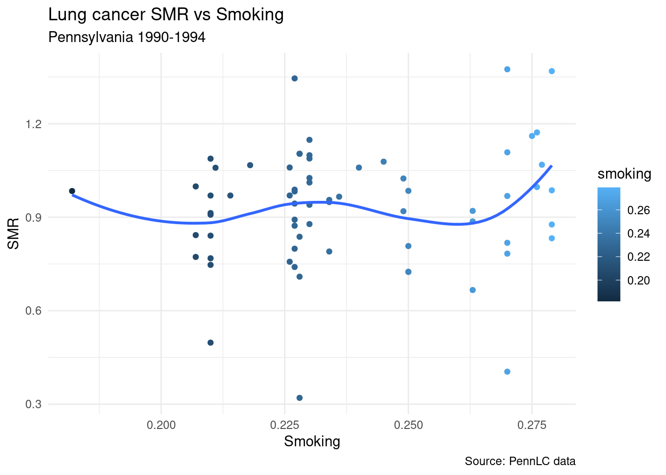
map %>%
  ggplot()+
  geom_sf(aes(fill=SMR), color="navy")+
  scale_fill_continuous(low="white", high="navy")+
  geom_sf_text(aes(label=county,
                   alpha=SMR,
                   color="orange"),
               size=2)+
  coord_sf()+
  guides(fill = guide_colorbar(title = "Cases"),
         alpha="none",
         color="none")+
  labs(title = "Lung cancer SMR",
       subtitle = "Pennsylvania 1990-1994",
       caption = "Source: PennLC data",
       fill = "SMR")+
  theme_minimal()