import matplotlib.pyplot as plt
import numpy as np
import seaborn as sns9. Plotting and Visualization
Learning Objectives
- We are going to learn the basic data visualization technique using matplotlib, pandas and seaborn.
Introduction
Making informative visualizations is one of the most important tasks in every exploratory data analysis process and this can be done using matplotlib. It may be a part of the exploratory process for example, to help identify outliers or needed data transformations, or as a way of generating ideas for models. For others, building an interactive visualization for the web may be the end goal. Python has many add-on libraries for making static or dynamic visualizations, but I’ll be mainly focused on matplotlib and libraries that build on top of it.
import the necessary library
```{python}
#| eval: false
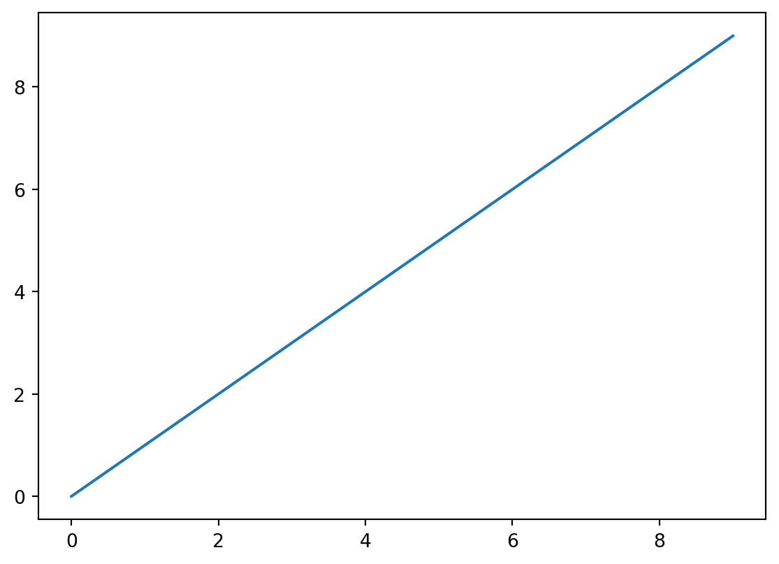
data = np.arange(10)
```array([0, 1, 2, 3, 4, 5, 6, 7, 8, 9])```{python}
#| eval: false
plt.plot(data)
```
We can use plt.show() function to display the plot in quarto
plt.show()When we are in jupyter notebook we can use %matplotlib notebook so that we can display the plot, but when we are in Ipython we can use %matplotlib to display the plot.
Customization of the visualization
While libraries like seaborn and pandas’s built-in plotting functions will deal with many of the mundane details of making plots, should you wish to customize them beyond the function options provided, you will need to learn a bit about the matplotlib API.
Figures and Subplots
Plots in matplotlib reside within a Figure object. You can create a new figure with plt.figure ()
fig = plt.figure()<Figure size 672x480 with 0 Axes>plt.figure has a number of options; notably, figsize will guarantee the figure has a certain size and aspect ratio if saved to disk.
You can’t make a plot with a blank figure. You have to create one or more subplots using add_subplot
Add Subplot
ax1 = fig.add_subplot(2,2, 1)

ax1<AxesSubplot:>This means that the figure should be 2 × 2, and we’re selecting the first of four subplots (numbered from 1). We can add more subplot
We can add more subplot
ax2 = fig.add_subplot(2, 2, 2)

ax3 = fig.add_subplot(2, 2, 3)

ax2

ax3<AxesSubplot:>Adding axis methods to the plot
These plot axis objects have various methods that create different types of plots, and it is preferred to use the axis methods over the top-level plotting functions like plt.show(). For example, we could make a line plot with the plot method.
fig = plt.figure()

ax1 = fig.add_subplot(2, 2, 1)

ax2 = fig.add_subplot(2, 2, 2)

ax3 = fig.add_subplot(2, 2, 3)

ax3.plot(np.random.standard_normal(50).cumsum(), color="black",
linestyle="dashed")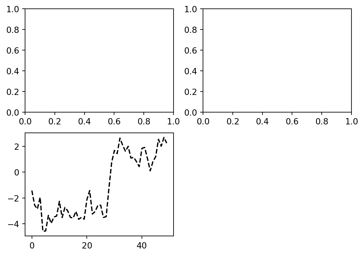
We may notice output like matplotlib.lines.Line2D at when we are creating our visualization. matplotlib returns objects that reference the plot subcomponent that was just added. A lot of the time you can safely ignore this output, or you can put a semicolon at the end of the line to suppress the output.
The additional options instruct matplotlib to plot a black dashed line. The objects returned by fig.add_subplot here are AxesSubplot objects, on which you can directly plot on the other empty subplots by calling each one’s instance method.
ax1.hist(np.random.standard_normal(100),bins=20,color="black", alpha=0.3);

ax2.scatter(np.arange(30), np.arange(30) + 3*np.random.standard_normal(30));
To make creating a grid of subplots more convenient, matplotlib includes a plt.subplots method that creates a new figure and returns a NumPy array containing the created subplot objects:
axes = plt.subplots(2, 3)

axes
(<Figure size 672x480 with 6 Axes>,
array([[<AxesSubplot:>, <AxesSubplot:>, <AxesSubplot:>],
[<AxesSubplot:>, <AxesSubplot:>, <AxesSubplot:>]], dtype=object))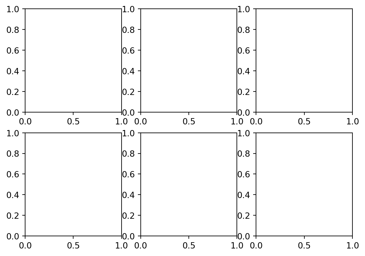
The axes array can then be indexed like a two-dimensional array; for example, axes[0, 1] refers to the subplot in the top row at the center
Scatter Plot
plt.style.use('_mpl-gallery')

# make the data
np.random.seed(3)
x = 4 + np.random.normal(0, 2, 24)
y = 4 + np.random.normal(0, 2, len(x))
# size and color:
sizes = np.random.uniform(15, 80, len(x))
colors = np.random.uniform(15, 80, len(x))

# plot
fig, ax = plt.subplots()

ax.scatter(x, y, s=sizes, c=colors, vmin=0, vmax=100)

ax.set(xlim=(0, 8), xticks=np.arange(1, 8),
       ylim=(0, 8), yticks=np.arange(1, 8))

plt.show()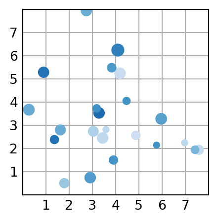
Bar Plot
plt.style.use('_mpl-gallery')

# make data:
np.random.seed(3)
x = 0.5 + np.arange(8)
y = np.random.uniform(2, 7, len(x))

# plot
fig, ax = plt.subplots()

ax.bar(x, y, width=1, edgecolor="white", linewidth=0.7)

ax.set(xlim=(0, 8), xticks=np.arange(1, 8),
       ylim=(0, 8), yticks=np.arange(1, 8))

plt.show()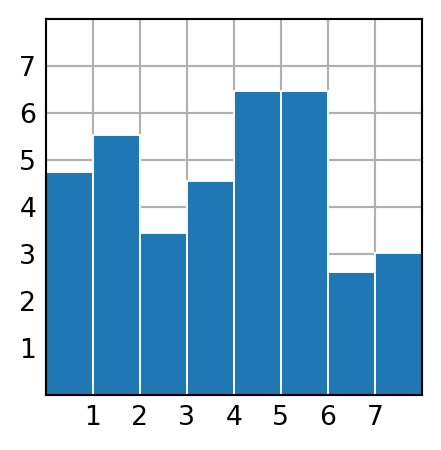
Box Plot
plt.style.use('_mpl-gallery')

# make data:
np.random.seed(10)
D = np.random.normal((3, 5, 4), (1.25, 1.00, 1.25), (100, 3))

# plot
fig, ax = plt.subplots()
VP = ax.boxplot(D, positions=[2, 4, 6], widths=1.5, patch_artist=True,
                showmeans=False, showfliers=False,
                medianprops={"color": "white", "linewidth": 0.5},
                boxprops={"facecolor": "C0", "edgecolor": "white",
                          "linewidth": 0.5},
                whiskerprops={"color": "C0", "linewidth": 1.5},
                capprops={"color": "C0", "linewidth": 1.5})

ax.set(xlim=(0, 8), xticks=np.arange(1, 8),
       ylim=(0, 8), yticks=np.arange(1, 8))

plt.show()
We can learn more with the matplotlib documentation
| Argument | Description |
|---|---|
| nrows | Number of rows of subplots |
| ncols | Number of columns of subplots |
| sharex | All subplots should use the same x-axis ticks (adjusting the xlim will affect all subplots) |
| sharey | All subplots should use the same y-axis ticks (adjusting the ylim will affect all subplots) |
| subplot_kw | Dictionary of keywords passed to add_subplot call used to create each subplot |
| fig_kw | Additional keywords to subplots are used when creating the figure, such as plt.subplots (2,2, figsize=(8,6)) |
Adjusting the spacing around subplots
By default, matplotlib leaves a certain amount of padding around the outside of the subplots and in spacing between subplots. This spacing is all specified relative to the height and width of the plot, so that if you resize the plot either programmatically or manually using the GUI window, the plot will dynamically adjust itself. You can change the spacing using the subplots_adjust method on Figure objects:
subplots_adjust(left=None, bottom=None, right=None, top=None, wspace=None, hspace=None)
wspace and hspace control the percent of the figure width and figure height, respectively, to use as spacing between subplots.
fig, axes = plt.subplots(2, 2, sharex=True, sharey=True)
for i in range(2):
    for j in range(2):
        axes[i, j].hist(np.random.standard_normal(500), bins=50,
                        color="black", alpha=0.5)
fig.subplots_adjust(wspace=0, hspace=0)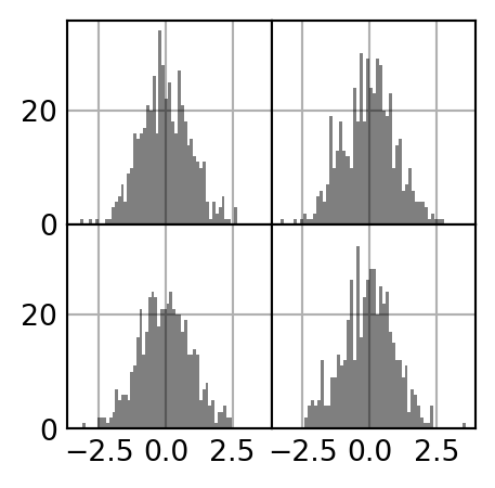
Colors, Markers, and Line Styles
matplotlib’s line plot function accepts arrays of x and y coordinates and optional color styling options. For example, to plot x versus y with green dashes, you would execute:
ax.plot(x, y, linestyle="--", color="green")ax = fig.add_subplot()
ax.plot(np.random.standard_normal(30).cumsum(), color="black",
linestyle="dashed", marker="o")
plt.show()line plots, you will notice that subsequent points are linearly interpolated by default. This can be altered with the drawstyle option.
fig = plt.figure()

ax = fig.add_subplot()

data = np.random.standard_normal(30).cumsum()

ax.plot(data, color="black", linestyle="dashed", label="Default");
ax.plot(data, color="black", linestyle="dashed",
drawstyle="steps-post", label="steps-post");
ax.legend()
<matplotlib.legend.Legend at 0x2c090478040>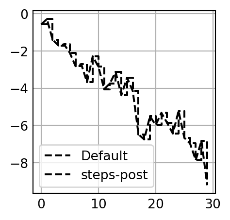
Ticks, Labels, and Legends
Most kinds of plot decorations can be accessed through methods on matplotlib axes objects. This includes methods like xlim, xticks, and xticklabels. These control the plot range, tick locations, and tick labels, respectively. They can be used in two ways:
Called with no arguments returns the current parameter value (e.g., ax.xlim() returns the current x-axis plotting range)
Called with parameters sets the parameter value (e.g., ax.xlim([0, 10]) sets the x-axis range to 0 to 10)
Setting the title, axis labels, ticks, and tick labels
fig, ax = plt.subplots()

ax.plot(np.random.standard_normal(1000).cumsum());

plt.show()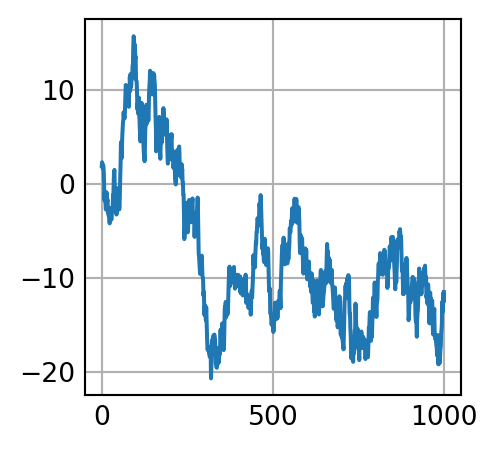
To change the x-axis ticks, it’s easiest to use set_xticks and set_xticklabels. The former instructs matplotlib where to place the ticks along the data range; by default these locations will also be the labels. But we can set any other values as the labels using set_xticklabels:
The rotation option sets the x tick labels at a 30-degree rotation. Lastly, set_xlabel gives a name to the x-axis, and set_title is the subplot title.
Adding legends
Legends are another critical element for identifying plot elements. There are a couple of ways to add one. The easiest is to pass the label argument when adding each piece of the plot:
fig, ax = plt.subplots()

ax.plot(np.random.randn(1000).cumsum(), color="black", label="one");
ax.plot(np.random.randn(1000).cumsum(), color="black", linestyle="dashed",
label="two");
ax.plot(np.random.randn(1000).cumsum(), color="black", linestyle="dotted",
label="three");


ax.legend()
<matplotlib.legend.Legend at 0x2c0904e2b90>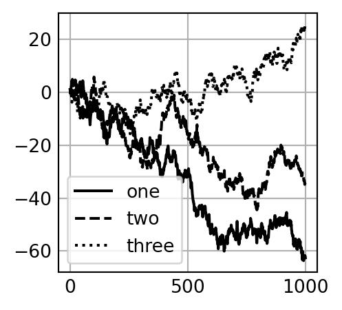
The legend method has several other choices for the location loc argument. See the docstring (with ax.legend?) for more information. The loc legend option tells matplotlib where to place the plot. The default is “best”, which tries to choose a location that is most out of the way. To exclude one or more elements from the legend, pass no label or label=“nolegend”.
Saving Plots to File
You can save the active figure to file using the figure object’s savefig instance method. For example, to save an SVG version of a figure, you need only type:
fig.savefig("figpath.png", dpi=400)| Argument | Description |
|---|---|
| fname | String containing a filepath or a Python file-like object. The figure format is inferred from the file extension (e.g., .pdf for PDF or .png for PNG). |
| dpi | The figure resolution in dots per inch; defaults to 100 in IPython or 72 in Jupyter out of the box but can be configured. |
| facecolor, edgecolor | The color of the figure background outside of the subplots; "w" (white), by default. |
| format | The explicit file format to use ("png", "pdf", "svg", "ps", "eps", ...). |
matplotlib Configuration
matplotlib comes configured with color schemes and defaults that are geared primarily toward preparing figures for publication. Fortunately, nearly all of the default behavior can be customized via global parameters governing figure size, subplot spacing, colors, font sizes, grid styles, and so on. One way to modify the configuration programmatically from Python is to use the rc method; for example, to set the global default figure size to be 10 × 10, you could enter:
The first argument to rc is the component you wish to customize, such as "figure", "axes", "xtick", "ytick", "grid", "legend", or many others. After that can follow a sequence of keyword arguments indicating the new parameters. A convenient way to write down the options in your program is as a dictionary:
plt.rc("font", family="monospace", weight="bold", size=8)plt.rc("figure", figsize=(10, 10))plt.rc("font", family="monospace", weight="bold", size=8)For more extensive customization and to see a list of all the options, matplotlib comes with a configuration file matplotlibrc in the matplotlib/mpl-data directory. If you customize this file and place it in your home directory titled .matplotlibrc, it will be loaded each time you use matplotlib.
All of the current configuration settings are found in the plt.rcParams dictionary, and they can be restored to their default values by calling the plt.rcdefaults() function.
The first argument to rc is the component you wish to customize, such as “figure”, “axes”, “xtick”, “ytick”, “grid”, “legend”, or many others. After that can follow a sequence of keyword arguments indicating the new parameters. A convenient way to write down the options in your program is as a dictionary:
Plotting with pandas and seaborn
matplotlib can be a fairly low-level tool. You assemble a plot from its base components: the data display (i.e., the type of plot: line, bar, box, scatter, contour, etc.), legend, title, tick labels, and other annotations. In pandas, we may have multiple columns of data, along with row and column labels. pandas itself has built-in methods that simplify creating visualizations from DataFrame and Series objects. Another library is seaborn, a high-level statistical graphics library built on matplotlib. seaborn simplifies creating many common visualization types.
Plotting with Pandas
Line Plots
import pandas as pd
import numpy as np

s = pd.Series(np.random.standard_normal(10).cumsum(), index=np.arange(0,
 100, 10))

s.plot()
<AxesSubplot:>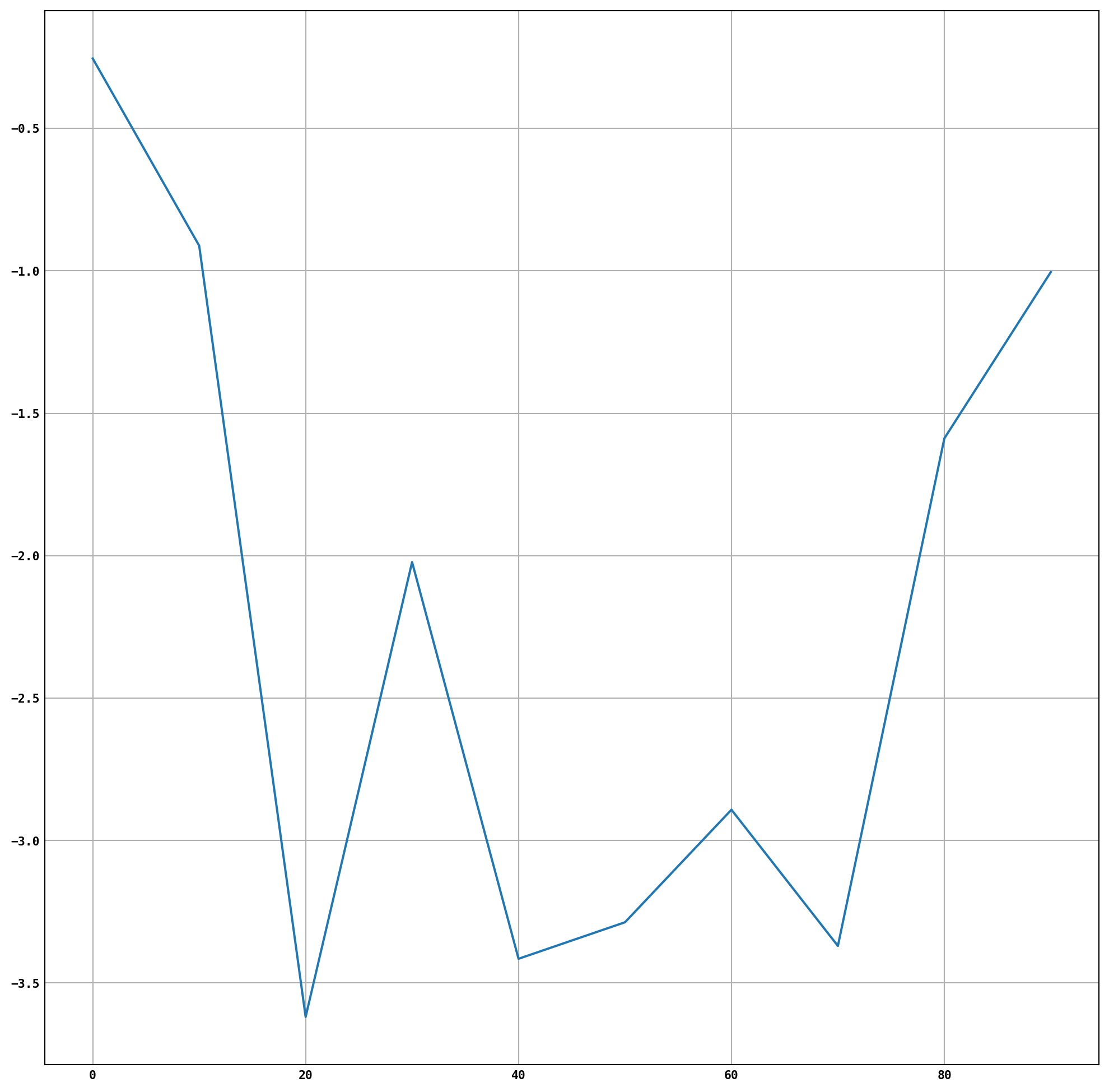
The Series object’s index is passed to matplotlib for plotting on the x-axis, though you can disable this by passing use_index=False. The x-axis ticks and limits can be adjusted with the xticks and xlim options, and the y-axis respectively with yticks and ylim.
| Argument | Description |
|---|---|
| label | Label for plot legend |
| ax | matplotlib subplot object to plot on; if nothing passed, uses active matplotlib subplot |
| style | Style string, like "ko--", to be passed to matplotlib |
| alpha | The plot fill opacity (from 0 to 1) |
| kind | Can be "area", "bar", "barh", "density", "hist", "kde", "line", or "pie"; defaults to "line" |
| figsize | Size of the figure object to create |
| logx | Pass True for logarithmic scaling on the x axis; pass "sym" for symmetric logarithm that permits negative values |
| logy | Pass True for logarithmic scaling on the y axis; pass "sym" for symmetric logarithm that permits negative values |
| title | Title to use for the plot |
| use_index | Use the object index for tick labels |
| rot | Rotation of tick labels (0 through 360) |
| xticks | Values to use for x-axis ticks |
| yticks | Values to use for y-axis ticks |
| xlim | x-axis limits (e.g., [0, 10]) |
| ylim | y-axis limits |
| grid | Display axis grid (off by default) |
Line Graph
df = pd.DataFrame(np.random.standard_normal((10, 4)).cumsum(0),
columns=["A", "B", "C", "D"],
index=np.arange(0, 100, 10))

plt.style.use('grayscale')

df.plot()
<AxesSubplot:>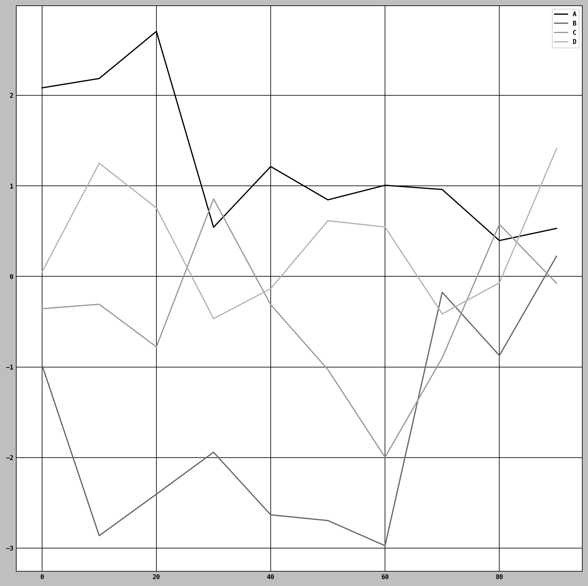
Here I used plt.style.use('grayscale') to switch to a color scheme more suitable for black and white publication, since some readers will not be able to see the full color plots. The plot attribute contains a “family” of methods for different plot types. For example, df.plot() is equivalent to df.plot.line()
Bar Plots
The plot.bar() and plot.barh() make vertical and horizontal bar plots, respectively. In this case, the Series or DataFrame index will be used as the x (bar) or y (barh) ticks
fig, axes = plt.subplots(2, 1)

data = pd.Series(np.random.uniform(size=16), index=list("abcdefghijklmnop"))

data.plot.bar(ax=axes[0], color="black", alpha=0.7)

data.plot.barh(ax=axes[1], color="black", alpha=0.7)
<AxesSubplot:>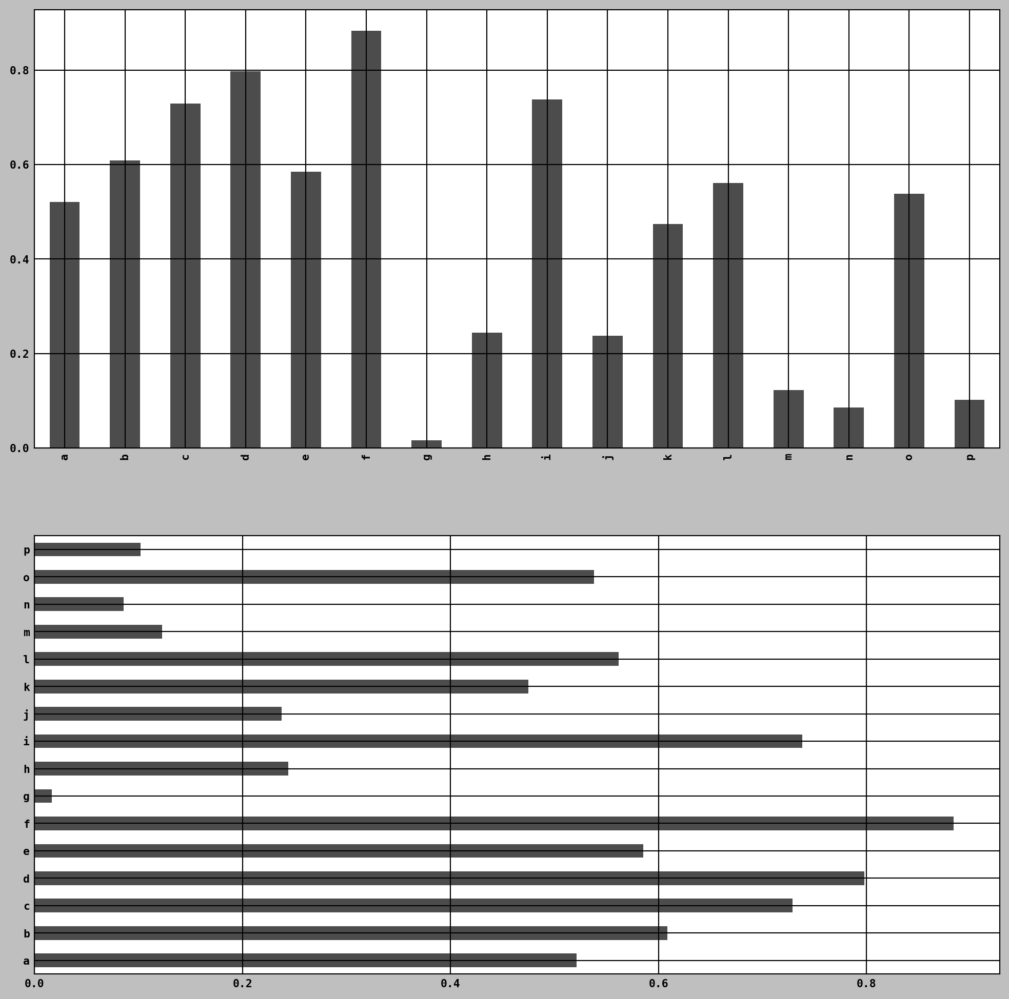
With a DataFrame, bar plots group the values in each row in bars, side by side, for each value.
df = pd.DataFrame(np.random.uniform(size=(6, 4)),
index=["one", "two", "three", "four", "five", "six"],
columns=pd.Index(["A", "B", "C", "D"], name="Genus"))

df


df.plot.bar()
<AxesSubplot:>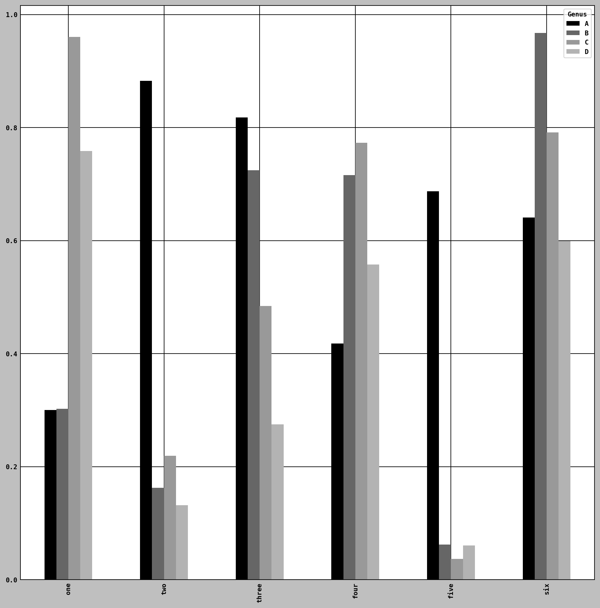
We create stacked bar plots from a DataFrame by passing stacked=True, resulting in the value in each row being stacked together horizontally
df.plot.barh(stacked=True, alpha=0.5)<AxesSubplot:>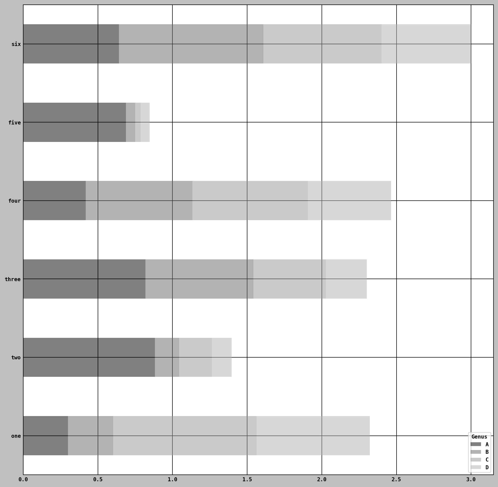
Visualizing categorical data with Seaborn
Plotting functions in seaborn take a data argument, which can be a pandas DataFrame. The other arguments refer to column names.
import seaborn as sns
tips = sns.load_dataset("tips")
sns.catplot(data=tips, x="day", y="total_bill")
<seaborn.axisgrid.FacetGrid at 0x2c08fd8c2b0>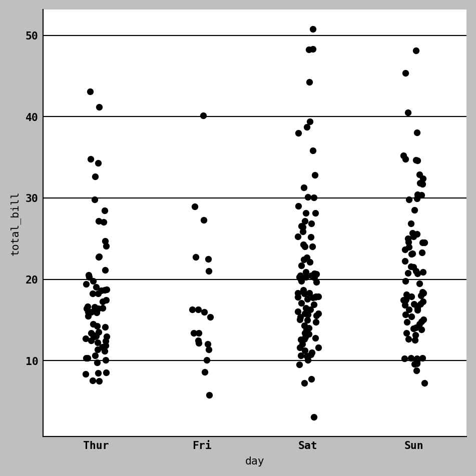
sns.catplot(data=tips, x="day", y="total_bill", hue="sex", kind="swarm")<seaborn.axisgrid.FacetGrid at 0x2c092177ac0>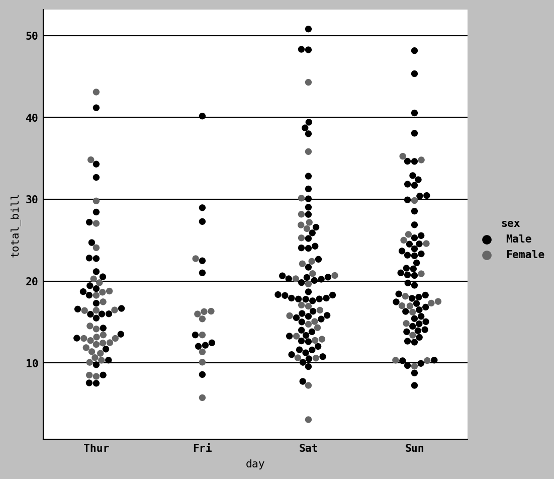
Boxplot
sns.catplot(data=tips, x="day", y="total_bill", kind="box")<seaborn.axisgrid.FacetGrid at 0x2c0906cbfd0>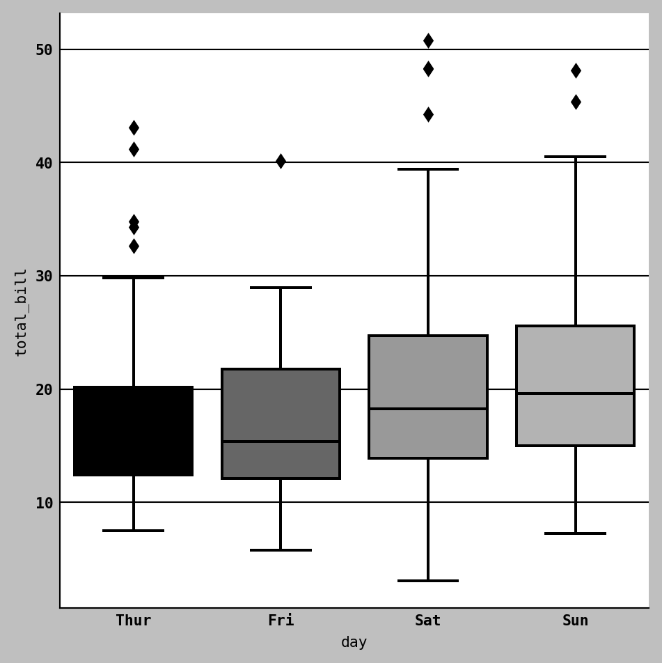
Barplot
titanic = sns.load_dataset("titanic")
sns.catplot(data=titanic, x="sex", y="survived", hue="class", kind="bar")
<seaborn.axisgrid.FacetGrid at 0x2c0904e2bf0>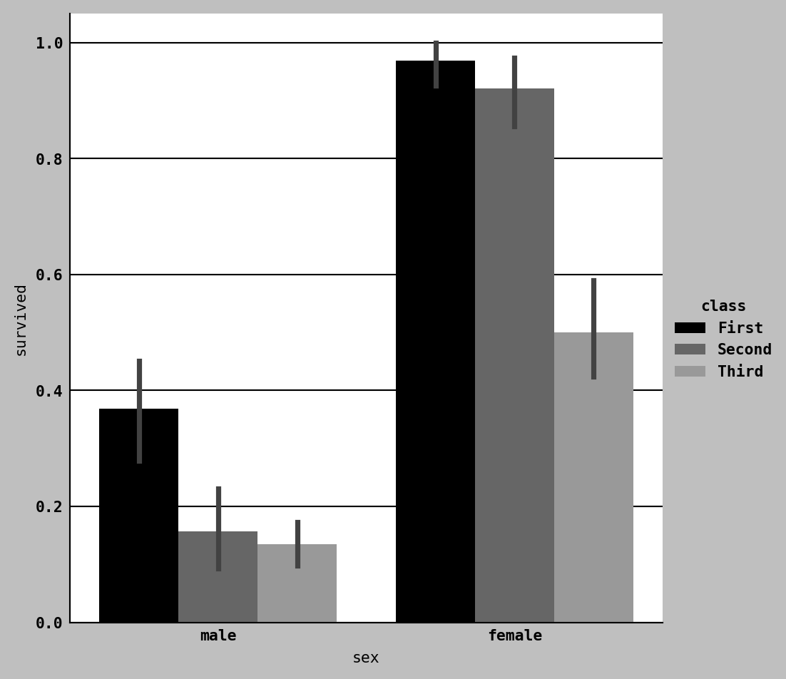
Scatter Plot
import pandas as pd
import seaborn as sns
penguin=pd.read_excel('data/penguins.xlsx')

ax = sns.regplot(x="bill_length_mm", y="flipper_length_mm", data=penguin)

ax
<AxesSubplot:xlabel='bill_length_mm', ylabel='flipper_length_mm'>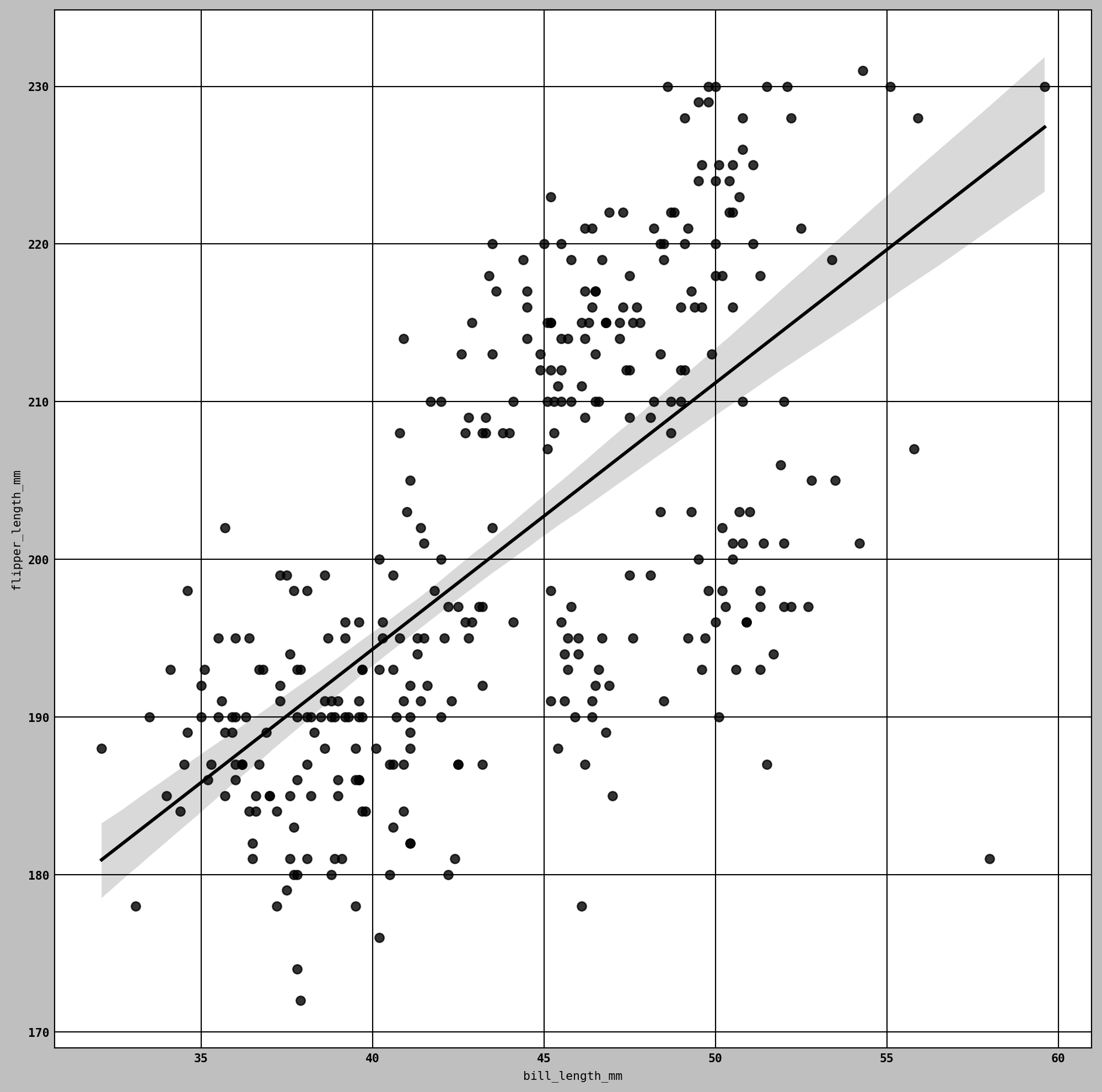
In exploratory data analysis, it’s helpful to be able to look at all the scatter plots among a group of variables; this is known as a pairs plot or scatter plot matrix.
sns.pairplot(penguin, diag_kind="kde", plot_kws={"alpha": 0.2})<seaborn.axisgrid.PairGrid at 0x2c0902b90c0>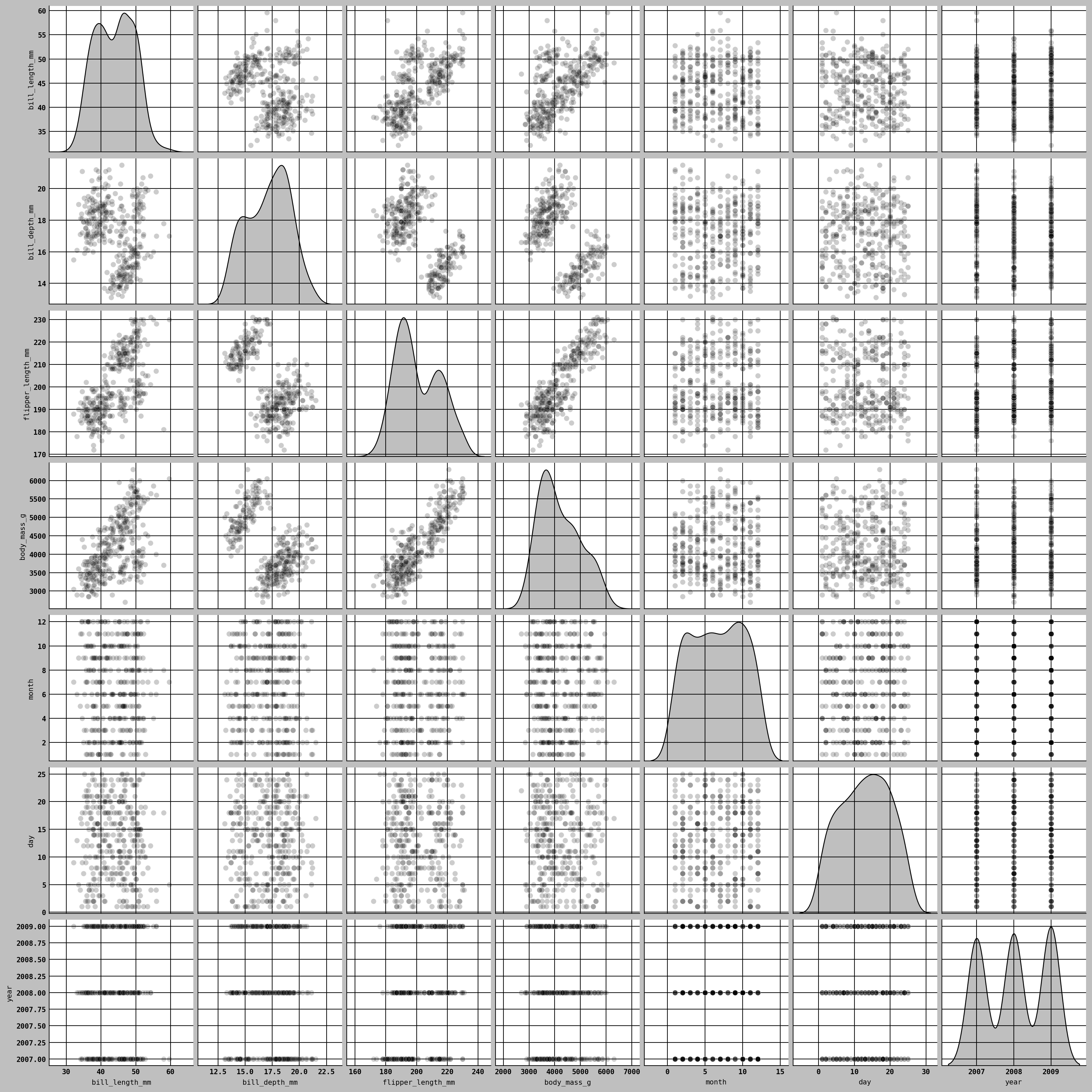
This plot_kws enables us to pass down configuration options to the individual plotting calls on the off-diagonal elements.
Point Plot
sns.catplot(data=titanic, x="sex", y="survived", hue="class", kind="point")<seaborn.axisgrid.FacetGrid at 0x2c08fdda5c0>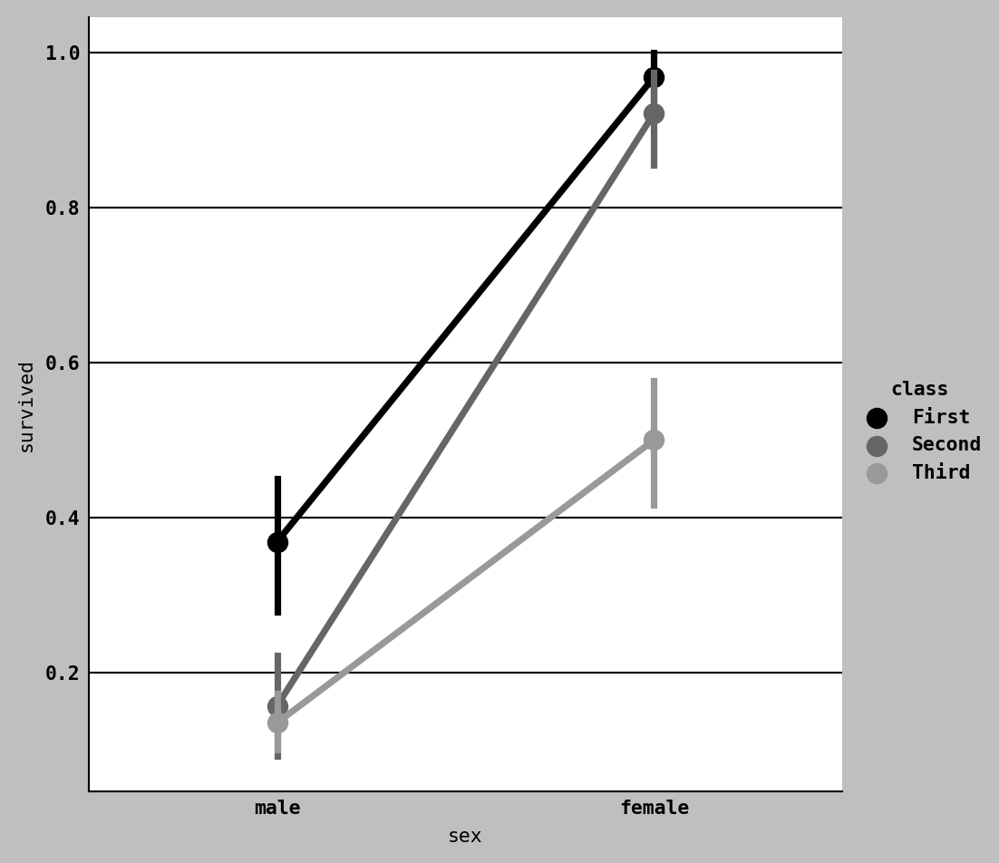
Line Plot
import numpy as np
import pandas as pd
import seaborn as sns
sns.set_theme(style="whitegrid")

rs = np.random.RandomState(365)
values = rs.randn(365, 4).cumsum(axis=0)
dates = pd.date_range("1 1 2016", periods=365, freq="D")
data = pd.DataFrame(values, dates, columns=["A", "B", "C", "D"])
data = data.rolling(7).mean()

sns.lineplot(data=data, palette="tab10", linewidth=2.5)
<AxesSubplot:>
Facet Grids and Categorical Data
One way to visualize data with many categorical variables is to use a facet grid, which is a two-dimensional layout of plots where the data is split across the plots on each axis based on the distinct values of a certain variable. seaborn has a useful built-in function catplot that simplifies making many kinds of faceted plots split by categorical variables
sns.catplot(x="species", y="bill_length_mm", hue="sex", col="island",
kind="bar", data=penguin)
<seaborn.axisgrid.FacetGrid at 0x2c09fc18280>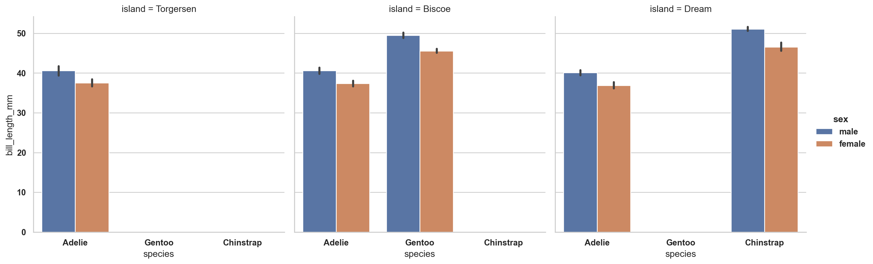
catplot supports other plot types that may be useful depending on what you are trying to display. For example, box plots (which show the median, quartiles, and outliers) can be an effective visualization type.
sns.catplot(x="bill_length_mm", y="island", kind="box",
data=penguin)
<seaborn.axisgrid.FacetGrid at 0x2c0984ba440>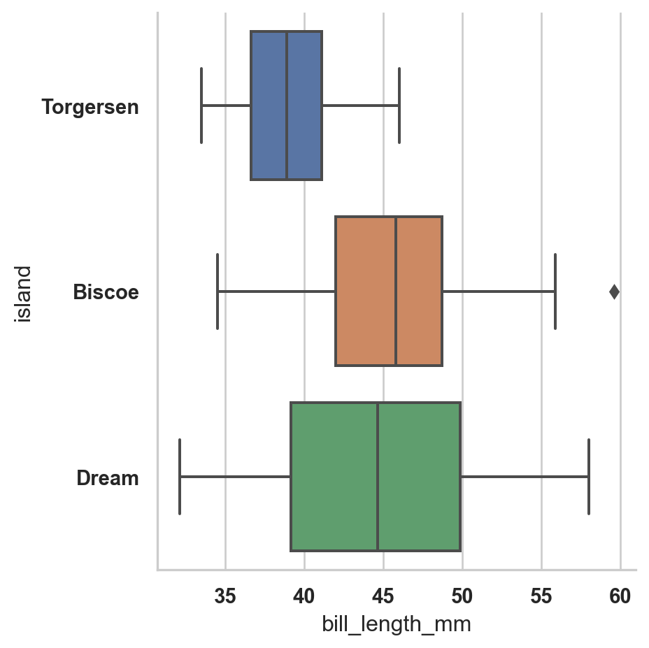
Other Python Visualization Tools
There are many other tools for data visualization in python such as [Altair](https://altair-viz.github.io/); [Bokeh](http://bokeh.pydata.org/) and [Plotly](https://plotly.com/python)
For creating static graphics for print or web, I recommend using matplotlib and libraries that build on matplotlib, like pandas and seaborn, for your needs.